One.
Two.
Three.
Four.
Five.
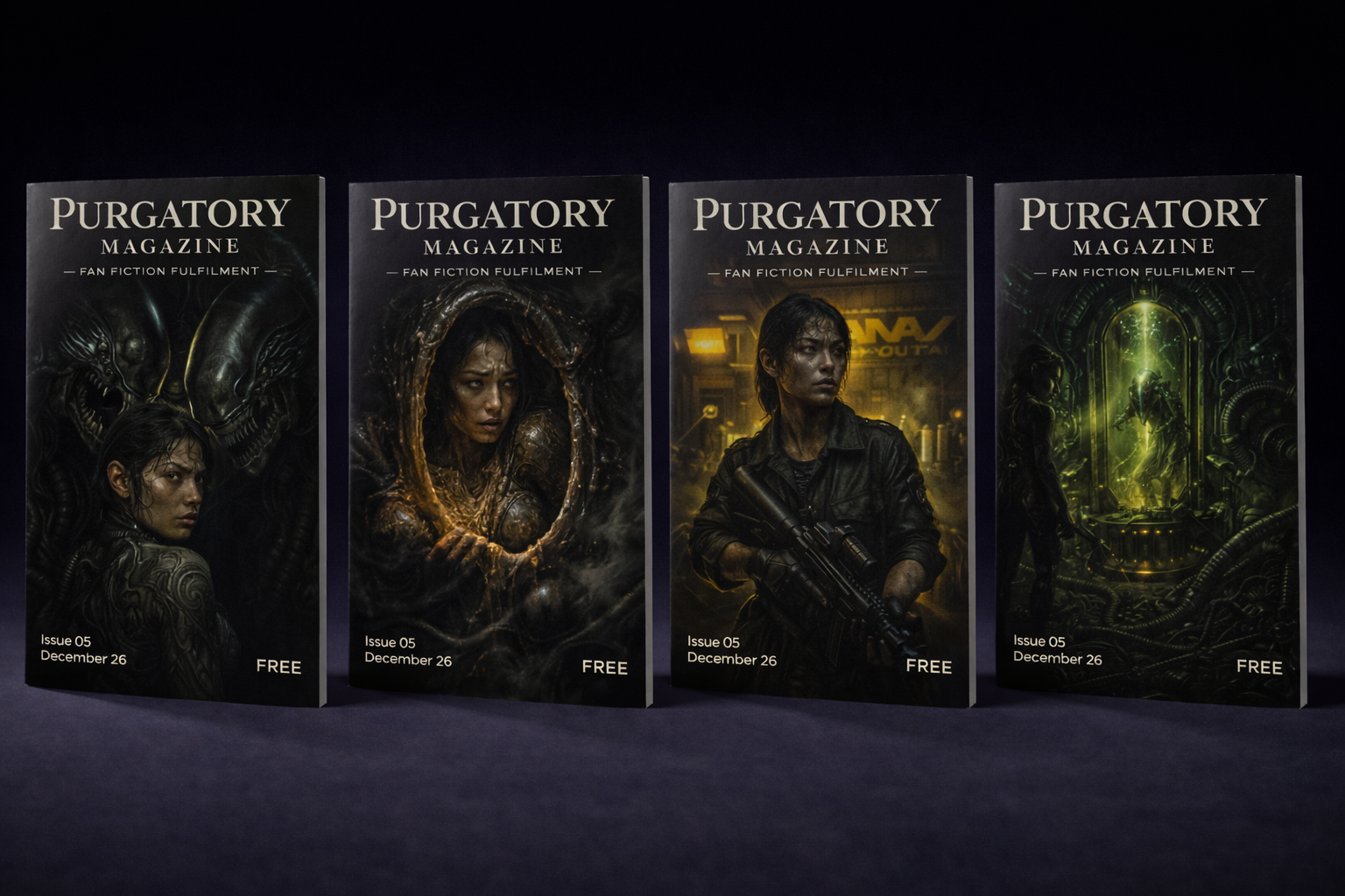
MY PERSONAL FAVOURITE POSTERS FROM THE ALIEN FRANCHISE
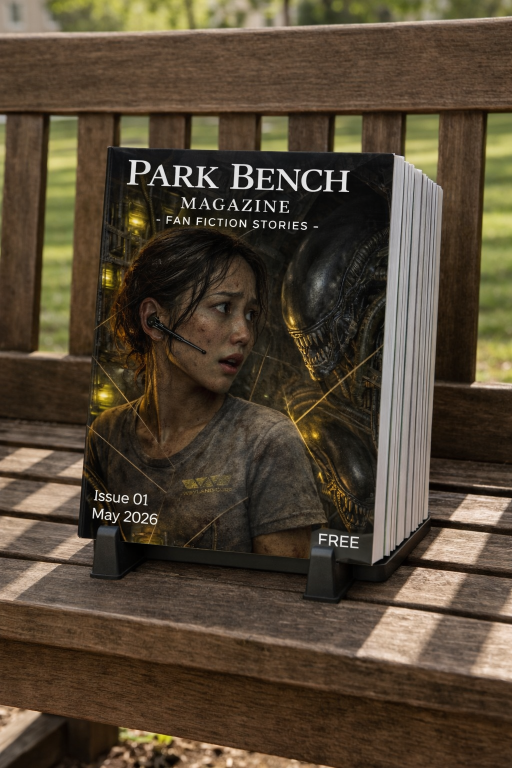
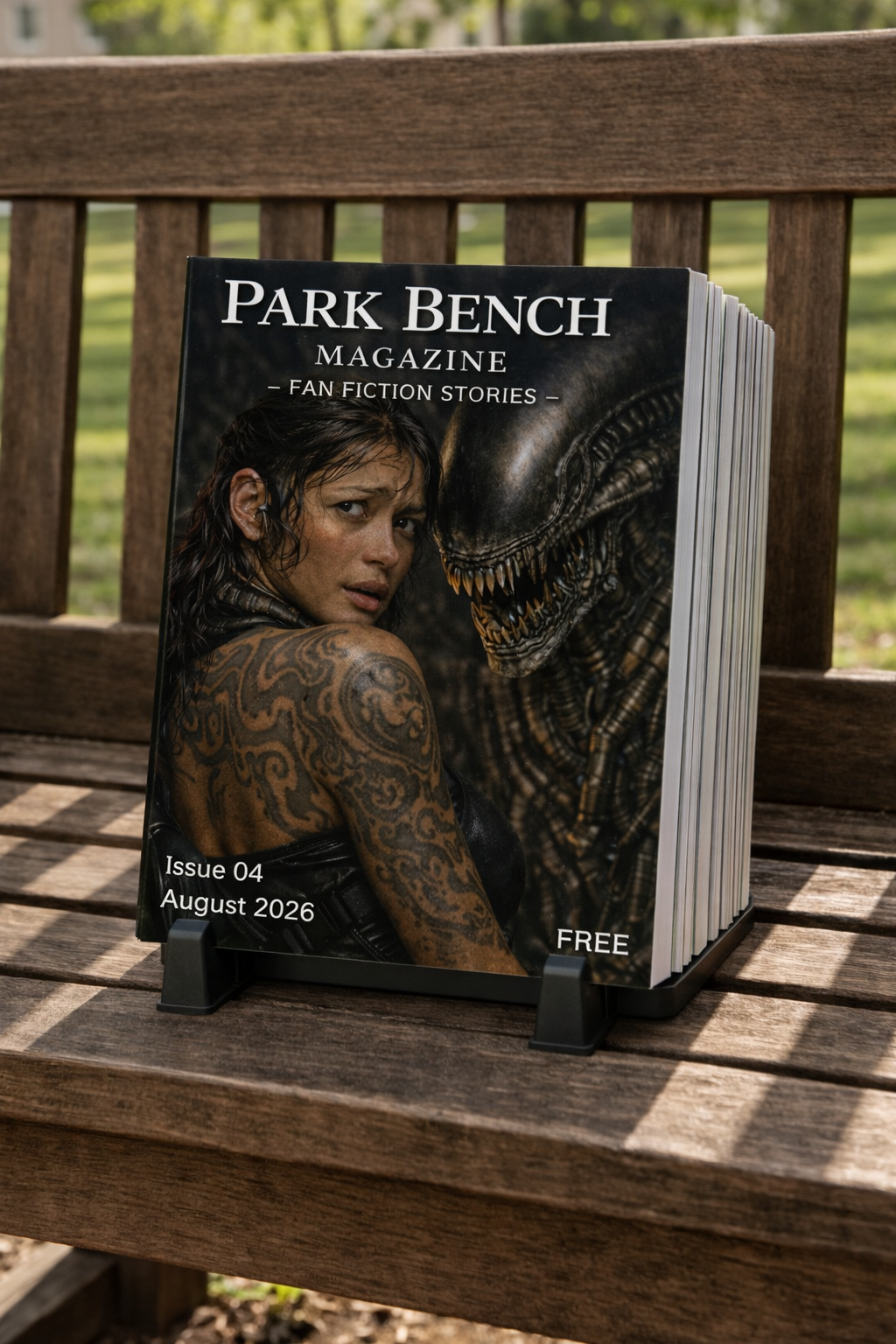
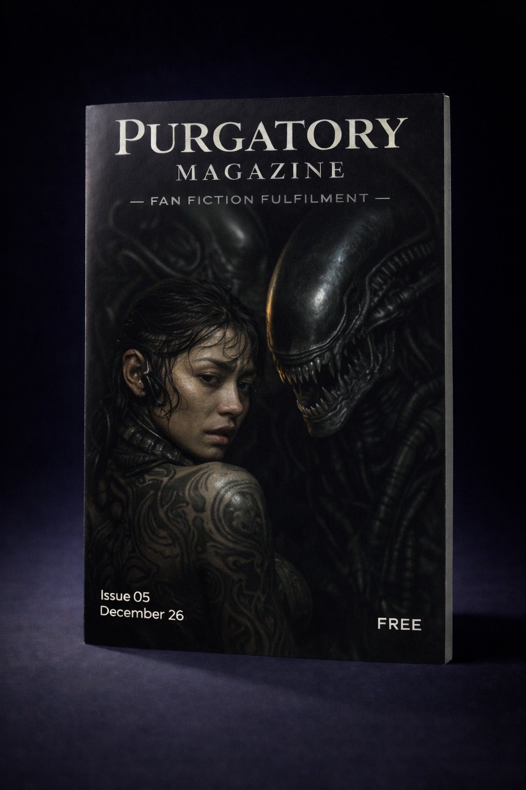
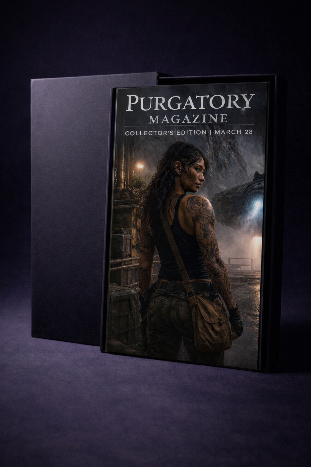
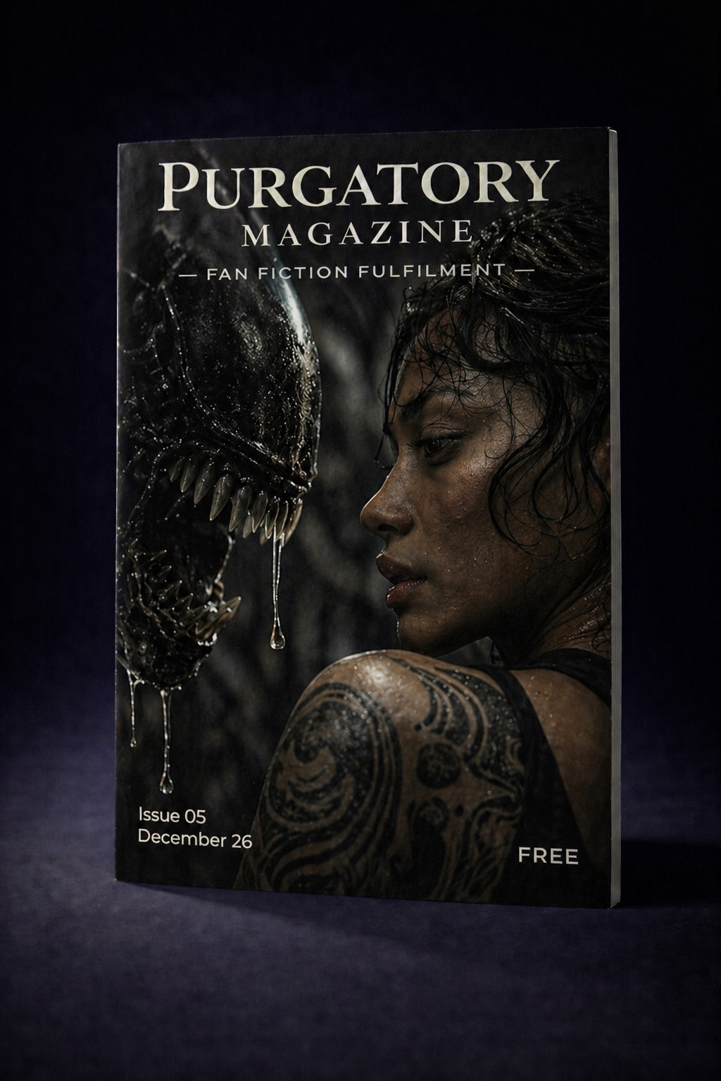
I believe we should take inspiration from the posters, for the cover art of our magazines.
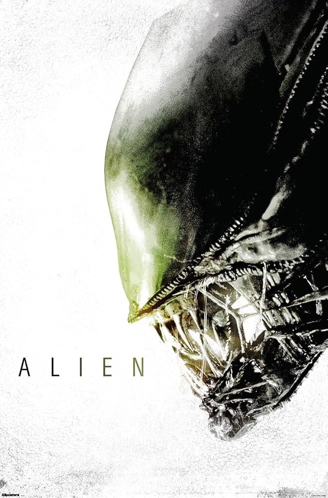
This one leans heavily into concealment. Most of the frame is empty, with the creature barely emerging from darkness, making presence more important than visibility.
The fragmented, almost folded texture of the poster adds an interesting layer. It feels manufactured, like something printed, handled and worn, which subtly mirrors the artificial, engineered themes of the film.
The composition suggests that what matters is not what you see, but what you almost see. The threat feels patient, not immediate.
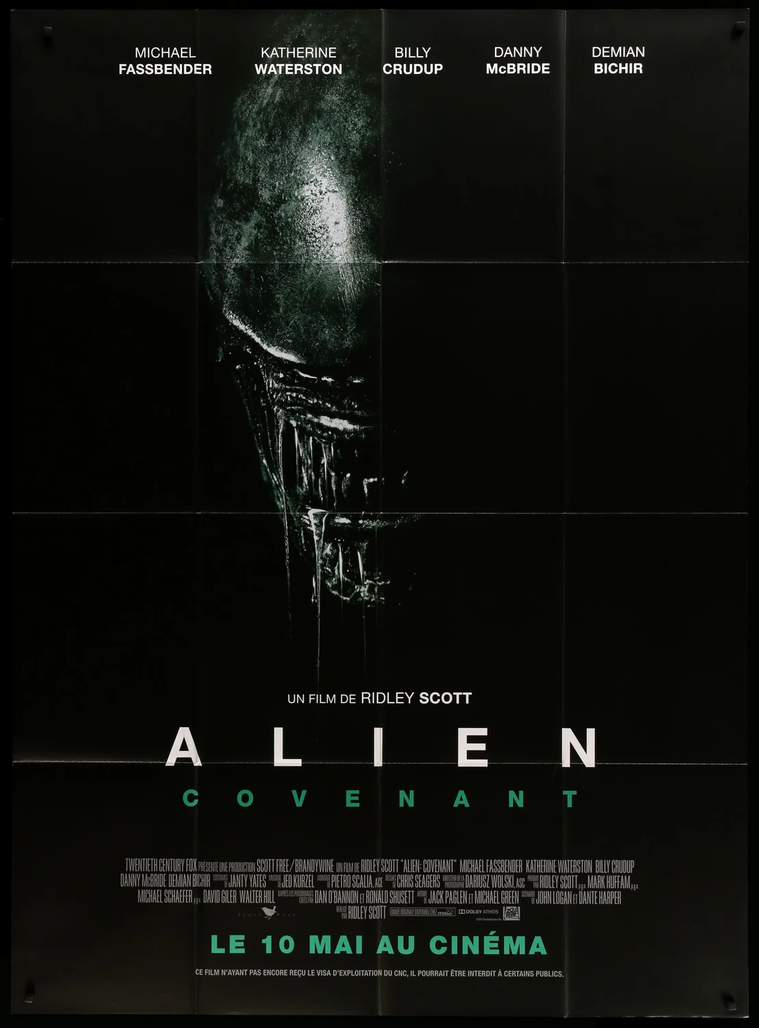
This one pushes intimacy and intrusion. The creature is no longer distant or symbolic, it’s close, dominating the frame, with the central light drawing the eye straight into its presence. It feels confrontational.
The heavy grain and textured finish give it a tactile, almost analogue quality. It feels dirty, aged and oppressive, like something uncovered rather than designed. That texture adds to the discomfort, making the image feel less polished and more real.
There’s also a sense of distortion in how the head fills the frame. It’s slightly overwhelming, as if the viewer is too close. The artist seems to be pushing the idea that the threat is no longer hidden, it’s already here.
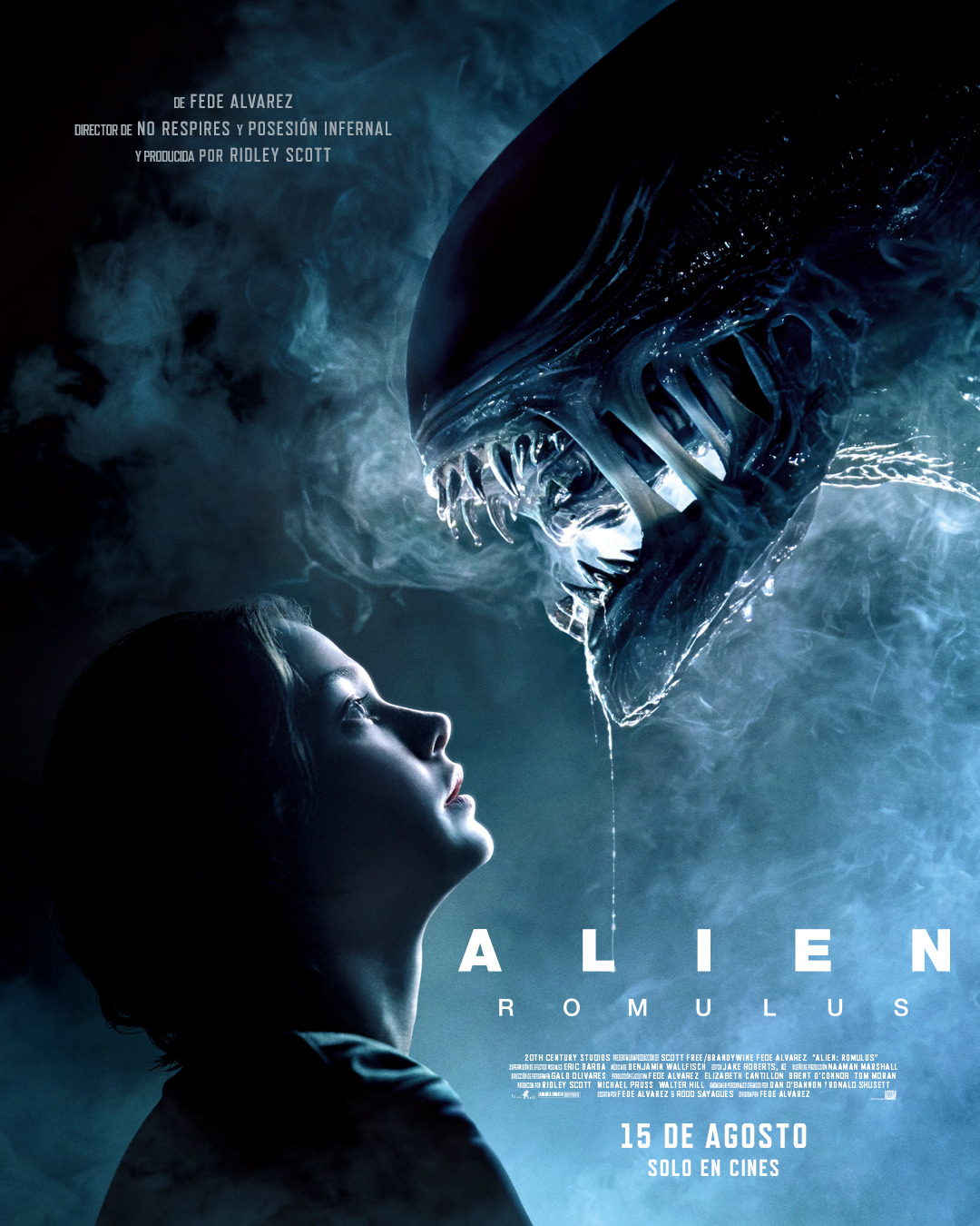
This feels like a moment of proximity rather than attack. The closeness between the human and the creature creates tension through stillness instead of action.
The cool blue lighting softens the image visually, but that softness contrasts with the danger of the situation. It gives the scene a quiet, almost intimate quality that makes it more uncomfortable.
There’s a sense of curiosity or inevitability in the way both figures are positioned. It doesn’t feel like a chase, it feels like a meeting that was always going to happen.
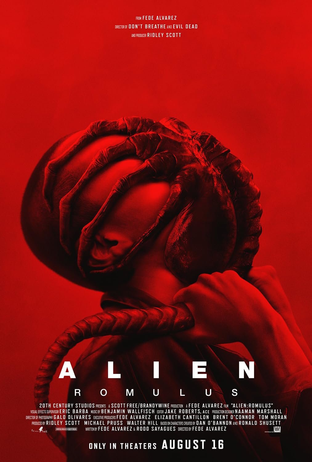
This one is far more aggressive and immediate. The full red palette removes subtlety completely, creating a visceral, almost suffocating intensity.
The composition focuses on restriction and control. The facehugger dominates the frame, wrapping and enclosing, making the human feel powerless within the image.
It feels more physical than psychological. There’s no distance, no mystery, just the raw reality of what is happening, which makes it uncomfortable in a very direct way.
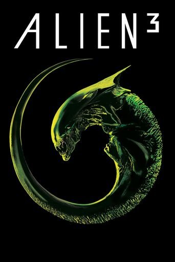
This reads more like a symbol than a literal creature. The coiled form creates a perfect, controlled shape, giving the impression of inevitability, like something that has already completed its cycle.
The use of green against black introduces a toxic, almost chemical tone. It feels contained, as if the creature exists within a system rather than a wild environment.
The restraint in the layout makes it feel deliberate and final. There’s very little noise, which gives the image a quiet sense of certainty rather than chaos.
A FEW CONCEPTS I THINK ARE INTERESTING
5.