

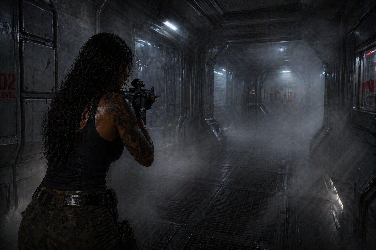
• Gripping the pipe, staying still and quiet while a Xenomorph walks below.
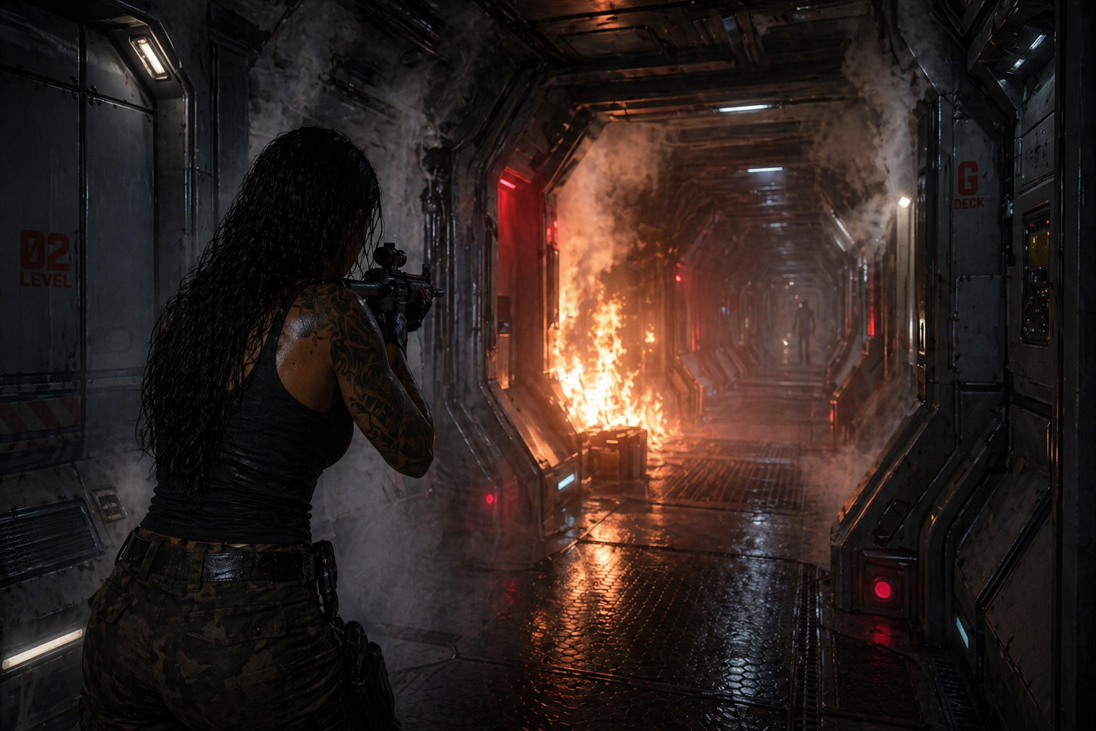
• Much later in the story: Harper vs an Elite Marine 01.
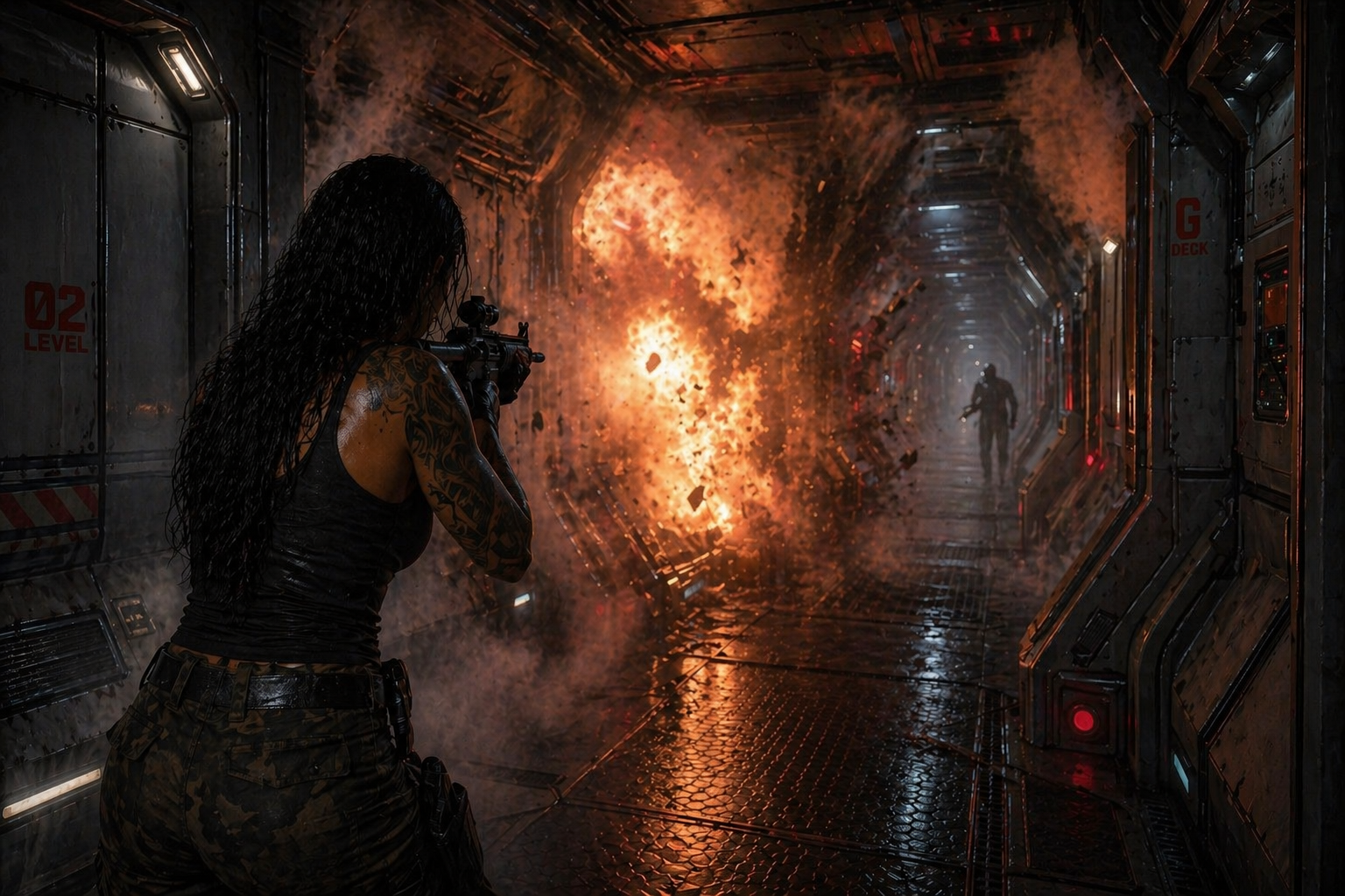
• Harper vs an Elite Marine 02.
• Harper vs an Elite Marine 03.

• Harper vs an Elite Marine 04.

• Harper vs an Elite Marine 05.
CORE VISUAL IDEA
At its heart, Alien: Salvage is about intrusion into a space that is no longer human.
The facility is not simply damaged or abandoned. It has been absorbed, repurposed and quietly reshaped into something organic, functional and hostile.
The environment should feel like a collision between two systems:
• Human-built infrastructure
• A living Xenomorph ecosystem
Neither fully replaces the other. Instead, they coexist in tension.
Spaces should feel partially recognisable, but wrong. Geometry interrupted. Surfaces reclaimed. Purpose distorted.
The audience should always feel that they are inside something that used to make sense.
ENVIRONMENT AS CHARACTER
The environment carries narrative weight equal to the characters.
It should feel:
• Oppressive rather than expansive
• Quiet rather than chaotic
• Alive without movement
There is a constant sense that the space is observing rather than reacting.
Human structures remain visible, but they are no longer in control. Corridors narrow unexpectedly. Materials shift from engineered to grown. Pathways feel guided, but not designed for human use anymore.
The deeper Harper moves, the less the space feels like a facility and the more it feels like a system.
HARPER WITHIN THE WORLD
Harper is not moving through the environment as an outsider.
She is attempting to pass through it as something that belongs.
This creates a very specific visual tension:
• Stillness over motion
• Control over reaction
• Precision over force
Moments should often feel suspended rather than active.
The most important visual idea here is restraint.
Where a typical approach might emphasise action, this story should emphasise the absence of it.
THREAT PRESENCE
The Xenomorph presence should rarely be fully revealed.
Instead, it should be felt through:
• Spatial awareness
• Negative space
• Subtle environmental cues
This could include:
• Surfaces that suggest recent movement
• Forms that may or may not be part of the environment
• Depths that obscure scale and distance
The audience should often be unsure whether they are looking at structure or organism.
Clarity is less important than unease.
LIGHTING APPROACH
Lighting should feel entirely motivated by the environment.
Primary sources may include:
• Emergency lighting systems
• Residual industrial fixtures
• Functional task lighting
These sources should feel unreliable, inconsistent or degraded.
Darkness is not just absence of light, it is a tool for shaping perception.
Important considerations:
• Light reveals only what is necessary
• Shadows carry information as much as highlights
• Visibility should feel limited, not cinematic
The goal is not to make things look dramatic, but to make them feel real and constrained.
MATERIAL LANGUAGE
Surfaces should communicate history and function.
Human elements:
• Worn metals
• Scratched panels
• Exposed wiring
• Industrial finishes
Hive elements:
• Organic layering
• Resin-like growth
• Smooth but irregular surfaces
• Structures that feel grown rather than assembled
Where these meet is where the visual identity becomes most interesting.
Transitions should feel gradual, not binary.
COLOUR PALETTE
The palette should support clarity of space and emotional tone rather than visual spectacle.
Suggested anchors:
• Desaturated industrial tones as a base
• Warm, low-intensity ambers from functional lighting
• Deep shadowed areas where detail is lost
Accents should be used sparingly and purposefully.
When colour stands out, it should mean something within the environment rather than simply adding visual interest.
SHOT PHILOSOPHY
Rather than defining specific shots, the following principles may help guide composition:
• Framing should often restrict rather than open up space
• Depth should feel uncertain or partially obscured
• Characters may be partially hidden within structure
• Negative space should carry tension
Moments of clarity should be rare and earned.
Most of the time, the audience should feel like they are piecing the space together as they move through it.
FINAL NOTE
This is a grounded, physical world.
Nothing should feel exaggerated, stylised or overly designed.
If something feels too clean, too composed or too intentional, it likely moves away from the tone.
The aim is to create a space that feels believable enough that the audience forgets it was ever constructed.