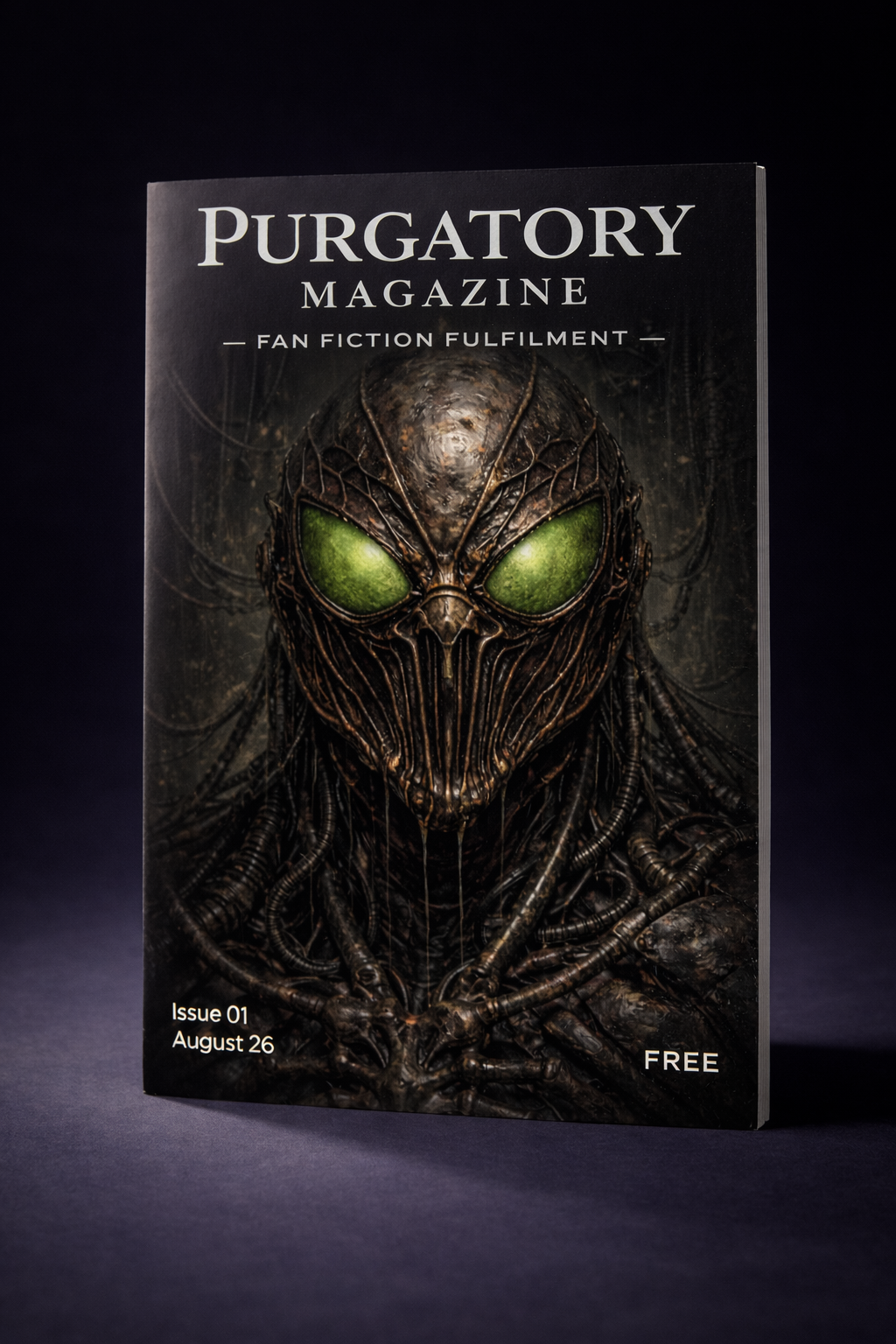
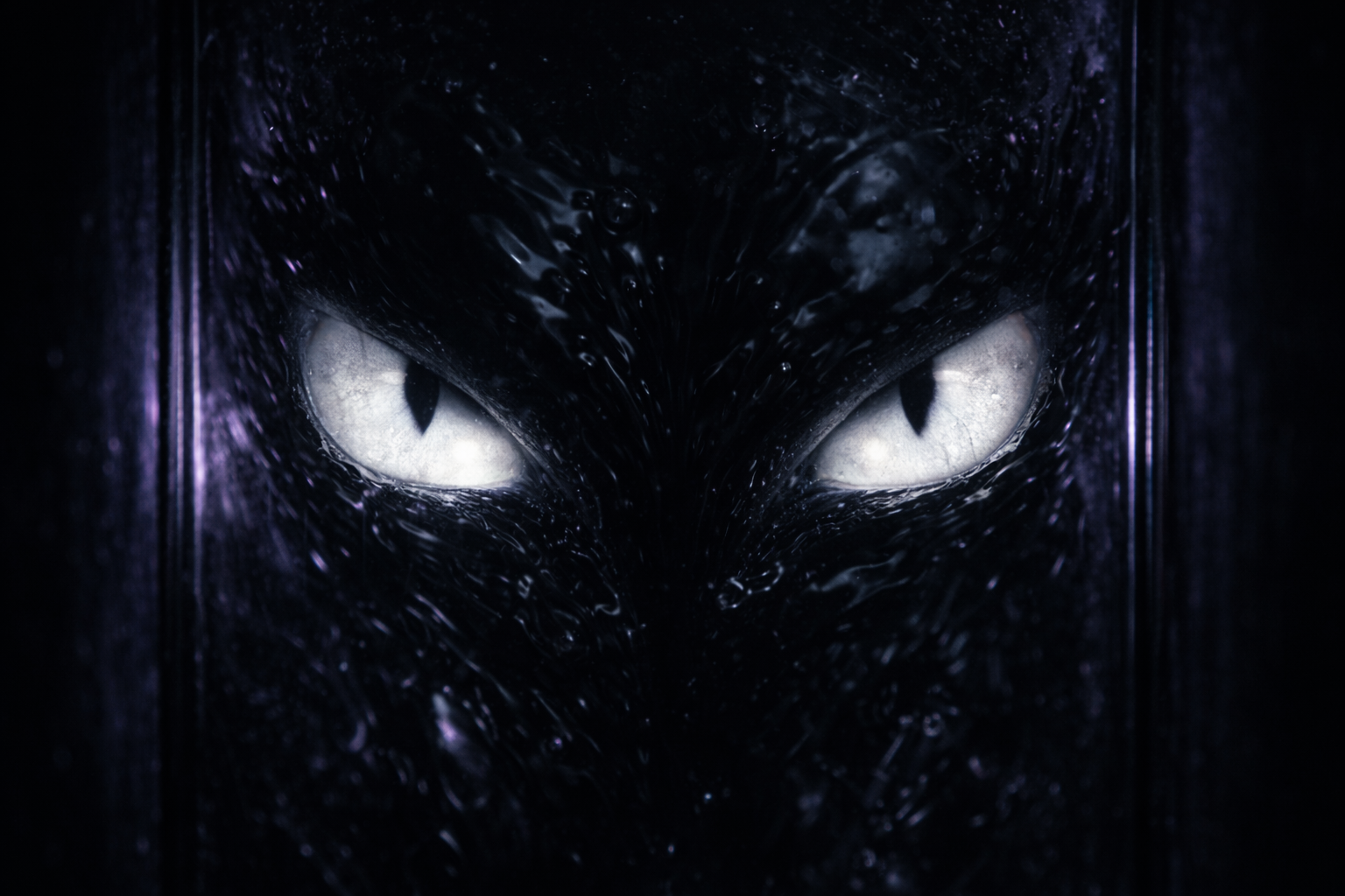
ARTIST: James >>
SUBJECT: The Host
CONCEPT:
The visual identity of Fan Fiction Fulfilment #01 is defined by the aesthetic of Industrial Decay. We are exploring a timeline where the “Age of Heroes” never happened replaced instead by a rusting failed industrial complex.
The imagery is not glossy superhero art. It is gritty textured and uncomfortable. We treat the “Spider” not as a costume but as a biological weapon, a parasite born in a lab not a hero born from an accident.
DESIGN PHILOSOPHY:
We chose a macro-photography approach to the cover art. By focusing closely on the mask we force the reader to confront the loss of humanity. The texture is wet and metallic blending the line between flesh and machine. It draws heavy inspiration from H.R. Giger emphasising that the suit is feeding on the host.
THE PRIMARY PALETTE:
• Toxic Green: The sickly bio-luminescent glow of the eyes representing the radioactive nature of the spider.
• Oiled Bronze: The dominant colour of the suit representing the rusted industrial ruins of Queens.
• Void Black: The organic cabling that binds the machine to the flesh.
COVER ART | OPTION B
SUBJECT: The Totem
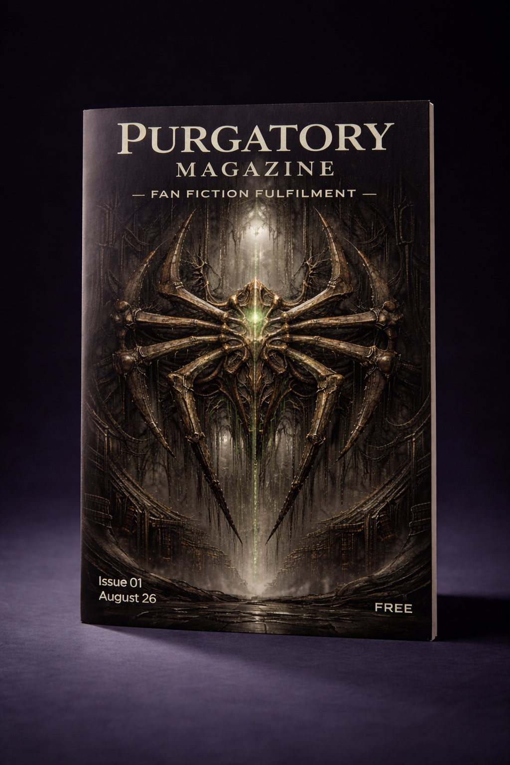
CONCEPT:
This cover concept shifts the focus from the character to the iconography. We are presenting the “Spider” symbol not as a badge of heroism but as a piece of heavy industrial machinery. It hangs in the void like a religious icon or a corporate brand for a failed state.
The image suggests that the “Spider” is bigger than just one person. It is a system. This approach leans heavily into the dystopian setting where the individual is less important than the machine.
DESIGN PHILOSOPHY:
We utilised a symmetrical composition to create a sense of order and oppression. The emblem is constructed from gears, pistons and wires which grounds the story in the “Tech-Rat” aesthetic. By removing the human element entirely we create a colder and more abstract feeling of dread. It implies that the humanity has already been consumed by the system.
THE PRIMARY PALETTE:
• Reactor Green: The central glow represents the radioactive power source at the heart of the machine.
• Cast Iron: The dark grey tones of the metal structure which provide weight and solidity.
• Abyssal Black: The background void that isolates the symbol.
COVER ART | OPTION C
SUBJECT: The Scavenger
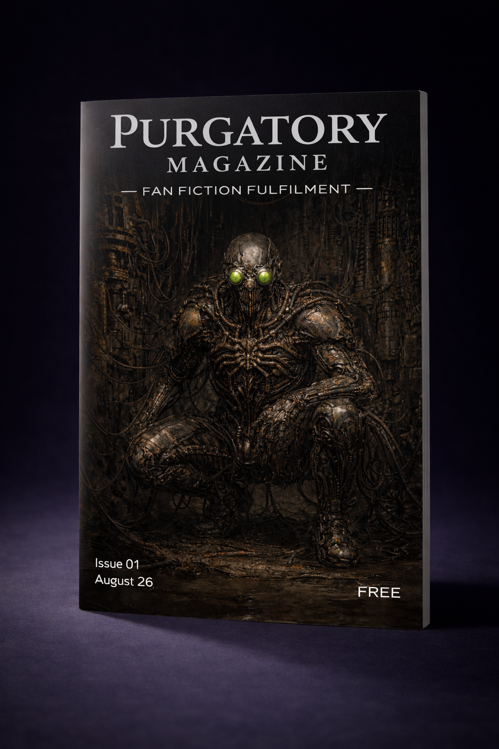
CONCEPT:
This cover focuses on world-building. We are introducing the reader to the timeline before we introduce the character. By placing the figure in a vast ruined industrial landscape we establish the stakes of survival.
The image deconstructs the superhero archetype. Peter is not posing on a skyscraper; he is crouching in the dirt. It tells the reader that this is a story about a bottom-feeder in a broken world rather than a guardian of a thriving city.
DESIGN PHILOSOPHY:
We chose a wide environmental composition to emphasise the isolation of the character. The suit is shown clearly as a piece of scavenged technology with exposed cables and mismatched plates. This grounds the “Tech-Rat” aesthetic immediately. The posture is animalistic and wary which suggests he is being hunted.
THE PRIMARY PALETTE:
• Oxidation Orange: The pervasive rust tones that define the decaying infrastructure of Queens.
• Bio-Lume Green: The faint glow of the suit eyes which acts as the only light source in the shadows.
• Concrete Grey: The cold and lifeless background textures.
INTERNAL TEAM NOTES
(Example Chat)
SAM: I have uploaded the three concepts for the cover. Option A establishes the horror. Option B establishes the brand. Option C establishes the world.
JAMES: Option C is fantastic environmental art but I worry the figure gets lost at thumbnail size. It works better as a double page spread inside. The “Tech-Rat” vibe is great but maybe too subtle for the front cover.
SUMMER: Option B is very “graphic design” which is cool but it feels a bit cold. It looks like a manifesto rather than a story. It might be too abstract for a character-driven piece.
SAM: I agree. Option A is the one that stops you scrolling. The texture on the jaw is visceral. It feels wet and uncomfortable which is exactly the Giger vibe we discussed.
SUMMER: It is actually repulsive. I love it. It tells the reader immediately that this is not the Spider-Man they know. It screams “Body Horror”.
JAMES: That is the hook. We need to distinguish this from the main Marvel canon instantly. The close-up does that best. It promises a very specific and dark experience.
THE VISUAL ARCHITECTURE | THE DERELICT’S PULSE
ARTIST: The Purgatory Team
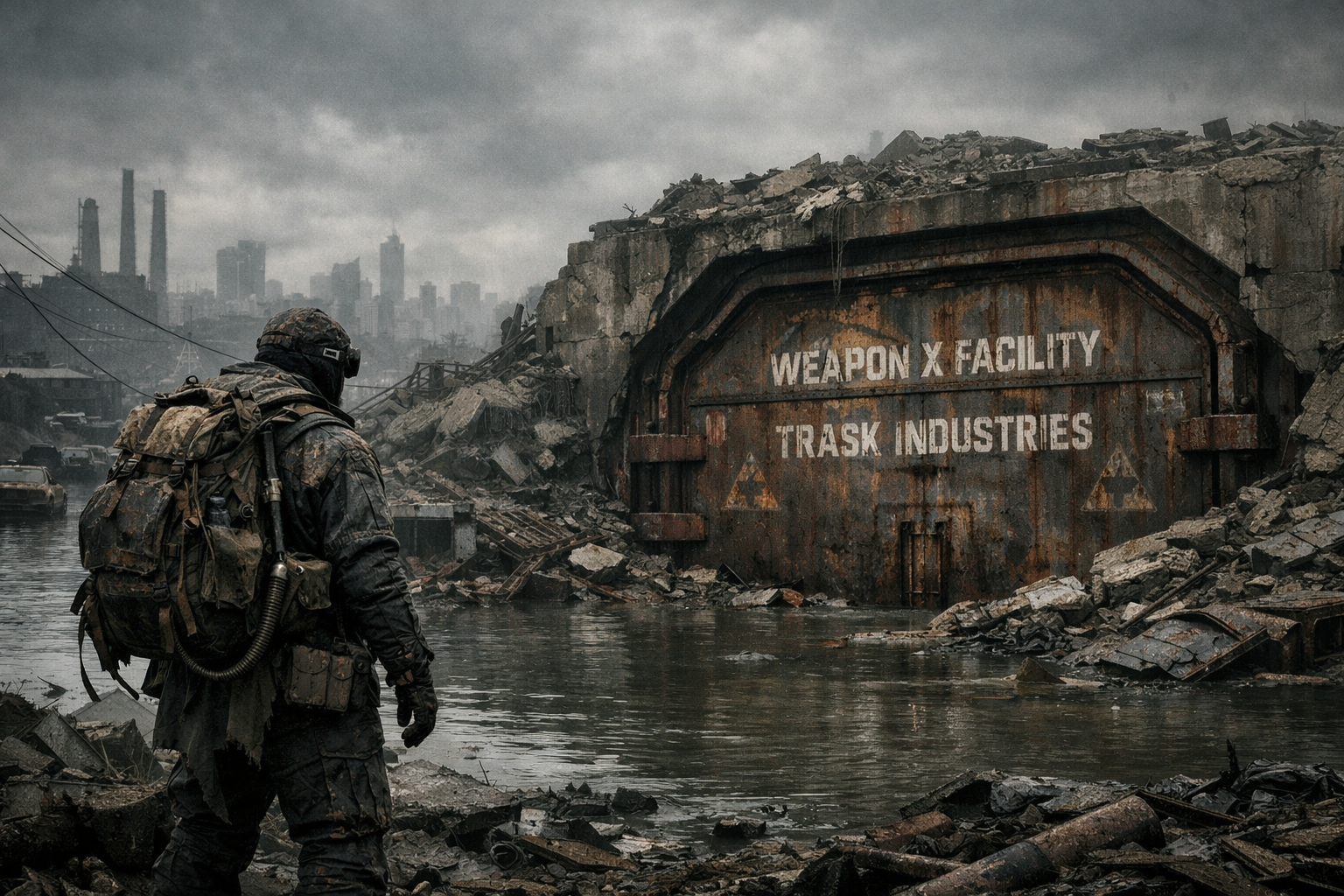
• The Trask Door: Establishes the scale perfectly.
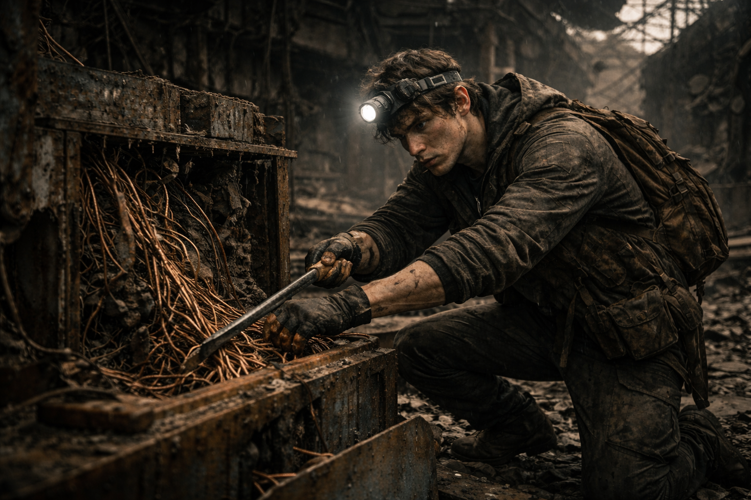
• The Tech-Rat: Sells the poverty and desperation.
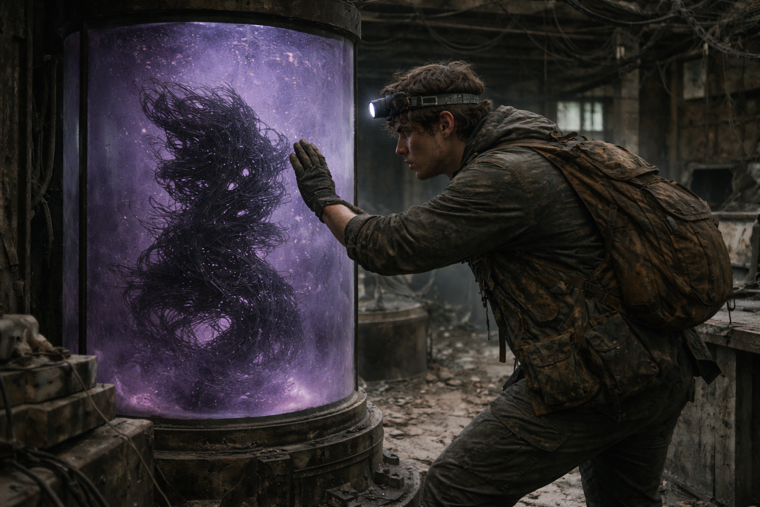
• The Tank: The violet lighting matches our palette exactly.
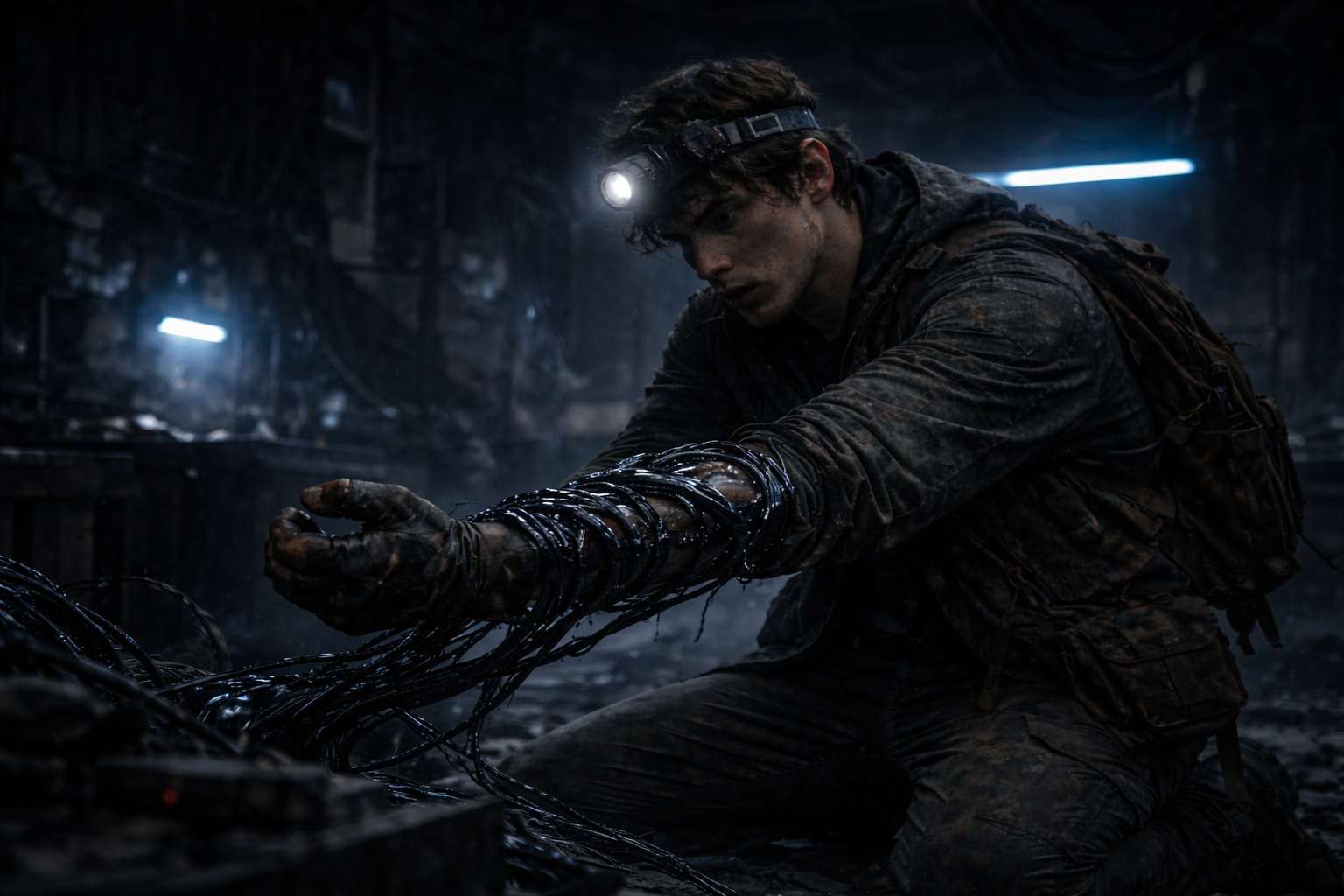
• The Infection: The way the wires are wrapping around his arm is visceral but not too gore-heavy.
• The Awakening: The high-contrast geometric pattern on the glass is terrifying. It confirms the intelligence of the weapon without needing to show a face.
CONCEPT:
The visual language of this story is defined by Bio-Industrial Realism. We wanted to ground the fantastical elements of the Spider-Man mythos in a gritty and tactile reality. The environment is not a comic book backdrop but a character in itself. It is wet, rusting and hostile.
We treat the “Super Power” as a foreign contaminant. The visuals focus on the contrast between the organic vulnerability of the human character and the cold hard machinery of the Weapon X facility.
DESIGN PHILOSOPHY:
We utilised a “Cinematic Survival” aesthetic. The lighting is low-key and motivated by practical sources like headlamps and emergency strips. This creates deep shadows which hide the horror until the last possible moment. The textures are heavy on grime, oil and oxidised metal to sell the “Tech-Rat” lifestyle.
THE PRIMARY PALETTE:
• Bunker Blue: The cold desaturated tone of the underground facility and emergency lighting.
• Oxidised Rust: The brown and orange tones of the decaying machinery which surrounds Peter.
• Bio-Lume Violet: The specific unnatural purple glow of the “Arachne” tank which signals the presence of the weapon.