
ARTIST: James >>
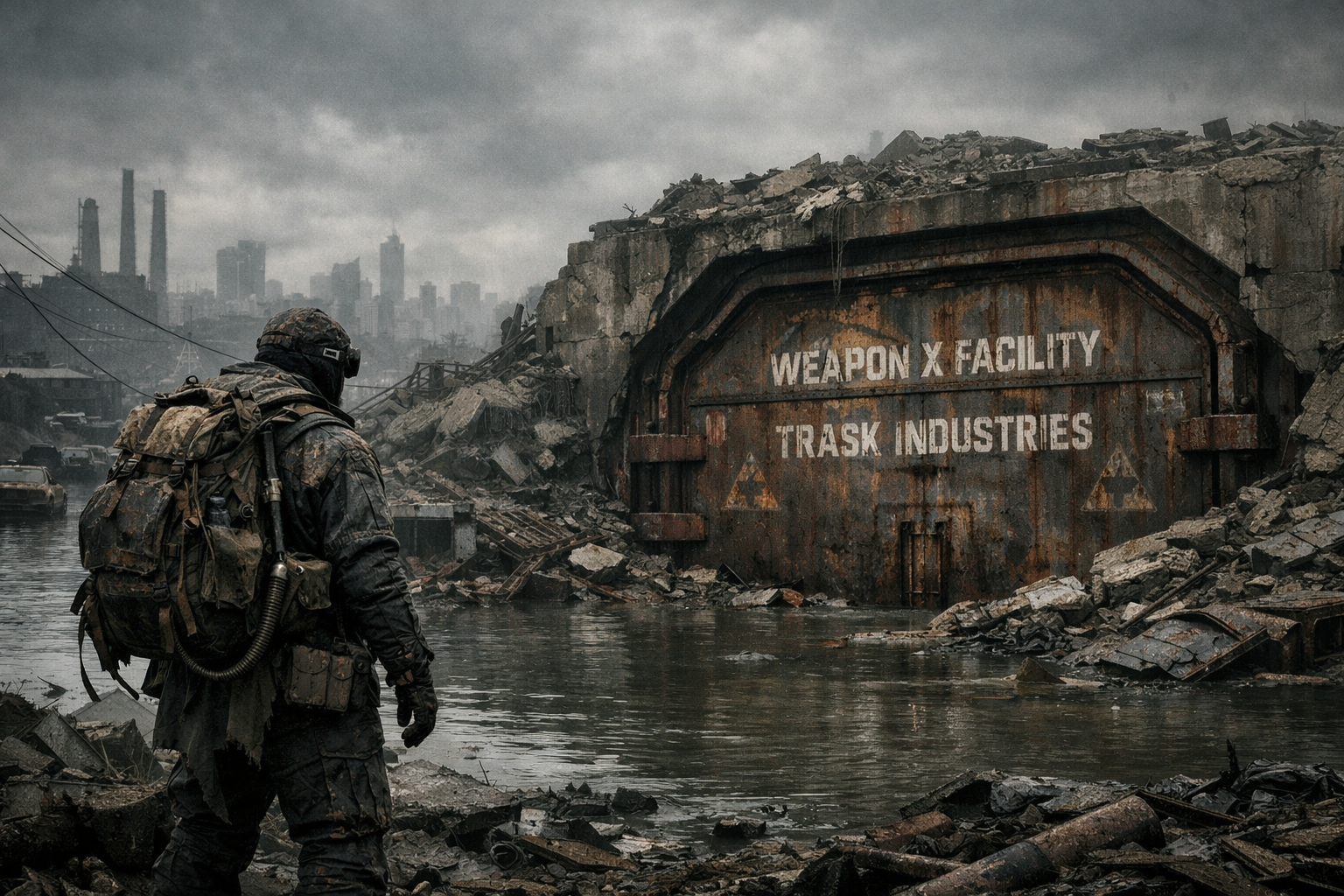
• The Trask Door: Establishes the scale perfectly.
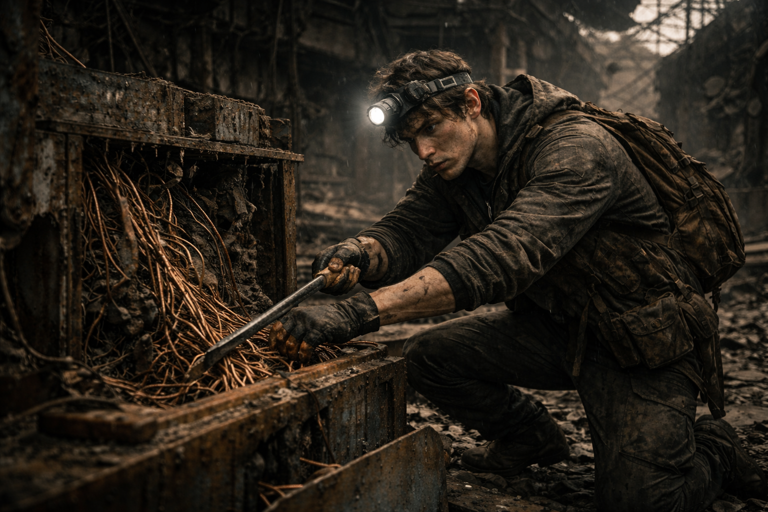
• The Tech-Rat: Sells the poverty and desperation.
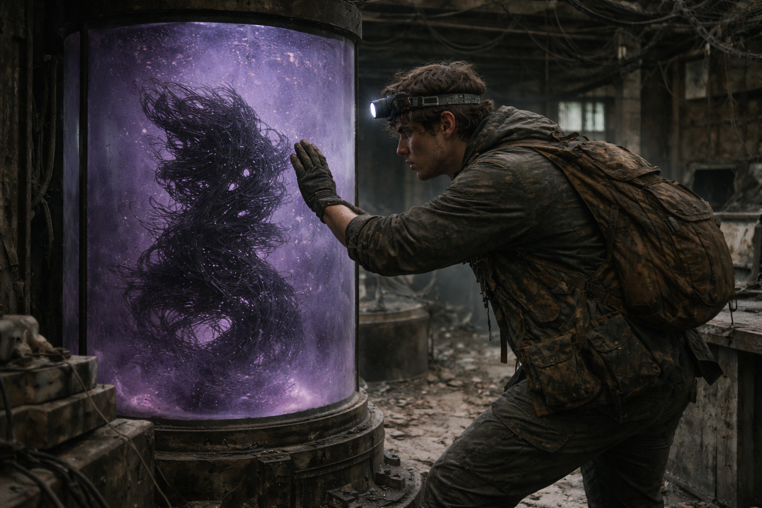
• The Tank: The violet lighting matches our palette exactly.
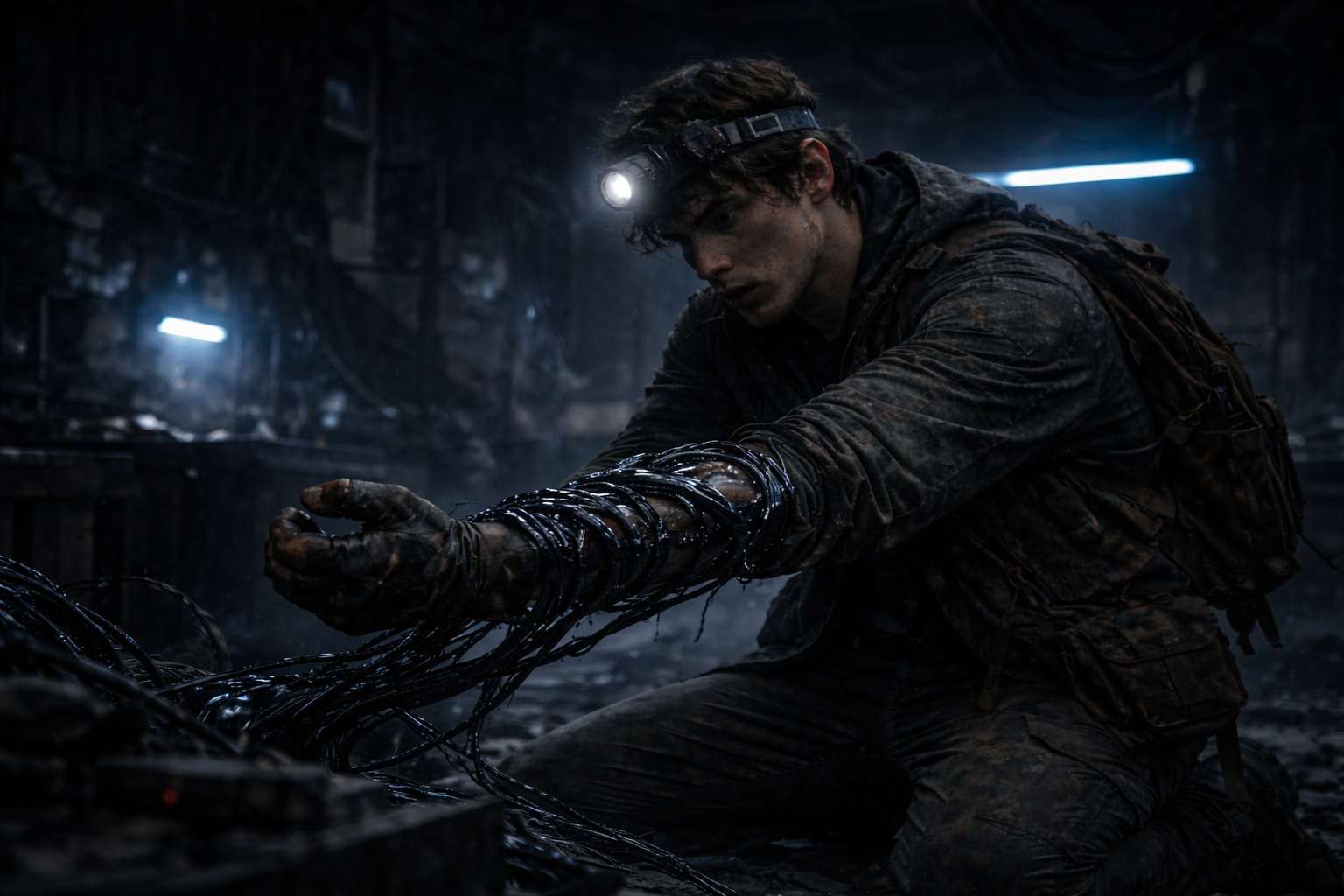
• The Infection: The way the wires are wrapping around his arm is visceral but not too gore-heavy.
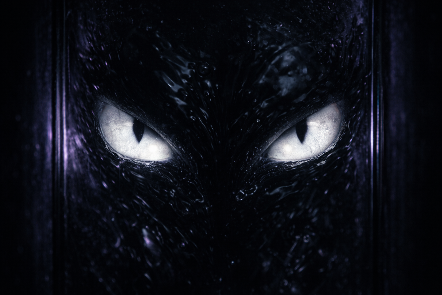
• The Awakening: The high-contrast geometric pattern on the glass is terrifying. It confirms the intelligence of the weapon without needing to show a face.
The visual language of this story is defined by Bio-Industrial Realism. We wanted to ground the fantastical elements of the Spider-Man mythos in a gritty and tactile reality. The environment is not a comic book backdrop but a character in itself. It is wet, rusting and hostile.
We treat the “Super Power” as a foreign contaminant. The visuals focus on the contrast between the organic vulnerability of the human character and the cold hard machinery of the Weapon X facility.
DESIGN PHILOSOPHY:
We utilised a “Cinematic Survival” aesthetic. The lighting is low-key and motivated by practical sources like headlamps and emergency strips. This creates deep shadows which hide the horror until the last possible moment. The textures are heavy on grime, oil and oxidised metal to sell the “Tech-Rat” lifestyle.
THE PRIMARY PALETTE:
• Bunker Blue: The cold desaturated tone of the underground facility and emergency lighting.
• Oxidised Rust: The brown and orange tones of the decaying machinery which surrounds Peter.
• Bio-Lume Violet: The specific unnatural purple glow of the “Arachne” tank which signals the presence of the weapon.