COVER ART
ARTIST: James >>
SUBJECT: 3
CONCEPT:
The visual identity of Original Anthologies #01 is defined by the architecture of silence. The cover art presents the “Monolith” which is a singular imposing structure standing in a cosmic purgatory. It is not a character nor a scene but a presence.
This image serves as the portal. It represents the heavy crushing weight of the unknown and the vast scale of the universe we are building. By stripping away human figures from the cover we signal to the reader that they are entering a space where humanity is small and the ideas are massive.
DESIGN PHILOSOPHY:
We chose a composition that emphasises scale and isolation. The Monolith anchors the brand identity in the genre of “High Concept Speculative Fiction”. It promises the reader that inside this collection they will find stories that are dense mysterious and worthy of exploration.
THE PRIMARY PALETTE:
• Abyssal Violet: The bruised colour of the cosmic horizon.
• Deep Space Black: The void that surrounds the stories.
• Cyan Signal: The faint electric glow of the unknown.
VISUAL ARCHITECTURE: THE UNBEARABLE STILLNESS OF BEING
ARTIST: Joanna Webb
CONCEPT:
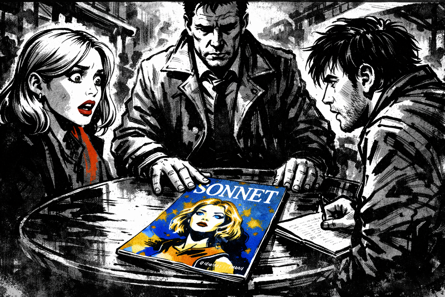
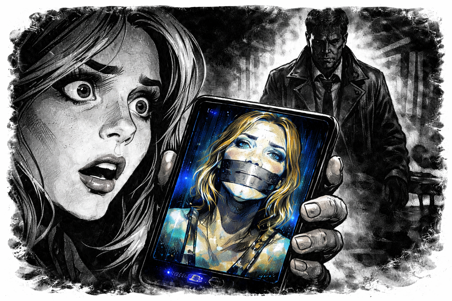
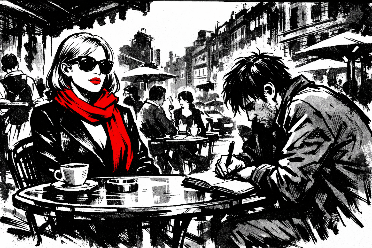
The visual language of this story is defined by the clash between the mundane and the catastrophic. We utilise a rough and chaotic ink style to mirror the noise of the busy street café. The world around Serena is a blur of grey noise which represents the public “static” that usually protects her.
The art strips away the realism to focus purely on the emotional stakes. The lines are jagged and urgent.
DESIGN PHILOSOPHY:
We chose a high-contrast ink wash technique to emphasise the isolation of the characters. By rendering the background in loose messy strokes we ensure the reader focuses entirely on the tension at the table. The lack of polish in the drawing style reflects the crumbling facade of Serena’s life.
THE PRIMARY PALETTE:
• Chromium Black: Heavy shadows and ink washes representing the void of the antagonist.
• Crimson: The colour of Serena’s scarf which represents her performance and the life she is trying to protect.
• Electric Blue: The jarring tone of the Sonnet magazine cover which signals that reality has breached the scene.